Raising awareness about childhood blindness
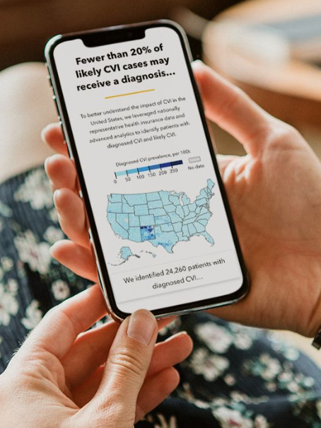
Our team supported the Perkins School for the Blind to raise awareness about CVI (Cerebral / Cortical Visual Impairment), the leading cause of childhood blindness and low vision.
CVI, a brain-based visual impairment, is common but underdiagnosed. Using health insurance data and advanced analytics, the CVI Center at Perkins found that approximately 4 out of 5 children and young adults are going undiagnosed.
How Might We Questions
How might we enhance awareness and diagnosis rates of CVI among healthcare providers, educators, parents, and policymakers across the U.S.?
How might we effectively convey the prevalence and impact of CVI through engaging and accessible data visualizations?
How might we tackle regional disparities in CVI diagnosis and access to care?
How might we humanize the data by integrating personal stories and experiences to provide context and depth?
Timeline
2.5 months
My Role
I led the design on this effort and worked with a visual designer, developer, medical doctors, and data scientists to translate the dataset into compelling data storytelling and visualizations.
My responsibilities included research, UX/Content strategy, UX/UI design, data visualization design, prototyping, and dev handoff. I also got to tiptoe into the dev side with some hands-on prototyping in d3 and JavaScript.
Impact
We launched the article, CVI By The Numbers, for CVI Awareness Month in September 2023. Through data storytelling and interactive maps, we showed CVI prevalence nationwide and explored various social factors affecting diagnosis and access to care. Our campaign resulted in Perkins' highest month of social media engagement, with over 900k interactions. Positive feedback from the CVI and medical communities validated the campaign's impact and effectiveness.
“The majority of caregivers don’t know their child has CVI and I was able to cite your research”
“We’ve heard from the medical community that this is sobering and actionable.”
Research
We visited the Perkins School and interviewed six students with CVI to gain deeper insights into their lived experience. Our interviews were incredibly moving — one student told us, “I wasn’t diagnosed until I was 19 because nobody believed me.” The students’ struggles with undiagnosed vision issues and the long journey to find specialized care really motivated us to make a difference.
We learned that the impact of CVI on vision varies greatly from person to person — we incorporated these stories into our design to humanize the data, reminding readers that behind every statistic lies a person.
Ideation
We kicked off the design process with a lightning sketching exercise, where every team member and stakeholder sketched out four initial design ideas. This allowed us to explore a wide range of creative concepts and perspectives, reaching a shared understanding and alignment early in the process.
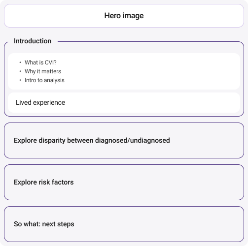
Based on our sketches and How-Might-Wes, I began wireframing. I started with the information architecture, blocking out content in a way that would thread the key points together into a compelling narrative.
Article information architecture
Early concepts
Prototyping with data
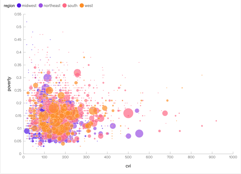
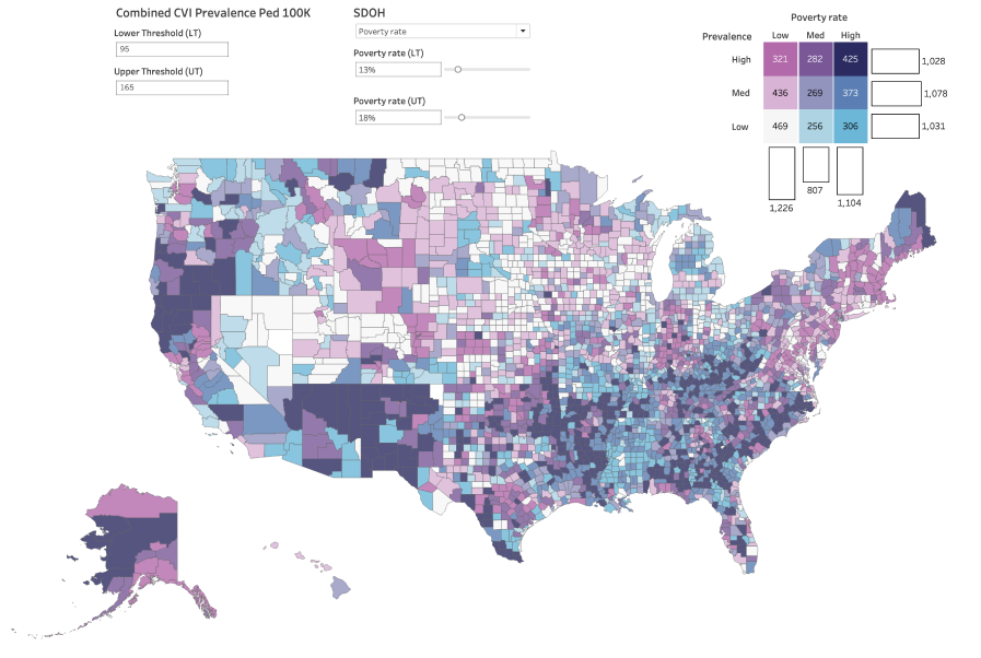
In parallel, we explored different approaches to visualize the data for each section. I created design concepts in Figma and simple charts in Flourish or Observable, while our data scientist developed more complex prototypes in Tableau.
Plugging in real data allowed us to pressure test our designs and helped us choose the most insightful visuals: maps!
Maps allowed us to emphasize the magnitude and extend of the problem in a relatable and digestible way for our intended audience. By mapping at the county level, we highlighted regional variations, enabling users to contextualize the data based on their location.
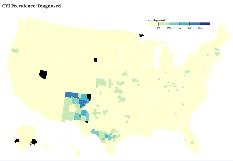
CVI prevalence map
Our goal for the prevalence map was to allow users compare diagnosed, likely, and total cases and explore regional differences. We considered toggles, bivariate choropleths, and sliders, but ultimately chose scrollytelling for its interactive and immersive experience.
The next design hurdle was selecting a suitable color scale. We needed to ensure that the data was neither exaggerated nor understated.
I created d3 prototypes of the maps in Observable, incorporating real data. I experimented with various color scale options:
After careful consideration, we opted for custom thresholds based on the extent of the underlying data. This approach allowed users to distinguish between diagnosed and likely cases, providing a nuanced view of CVI prevalence.
I worked with the Perkins brand/content strategist to arrive at a color palette that aligned with their brand identity and met their accessibility team’s color contrast standards.
Exploring social risk factors
After establishing the problem, we aimed to illustrate the challenges faced by children with CVI:
Limited familiarity with CVI among healthcare providers, even specialists
Restricted access to resources
Additional social risk factors exacerbating challenges
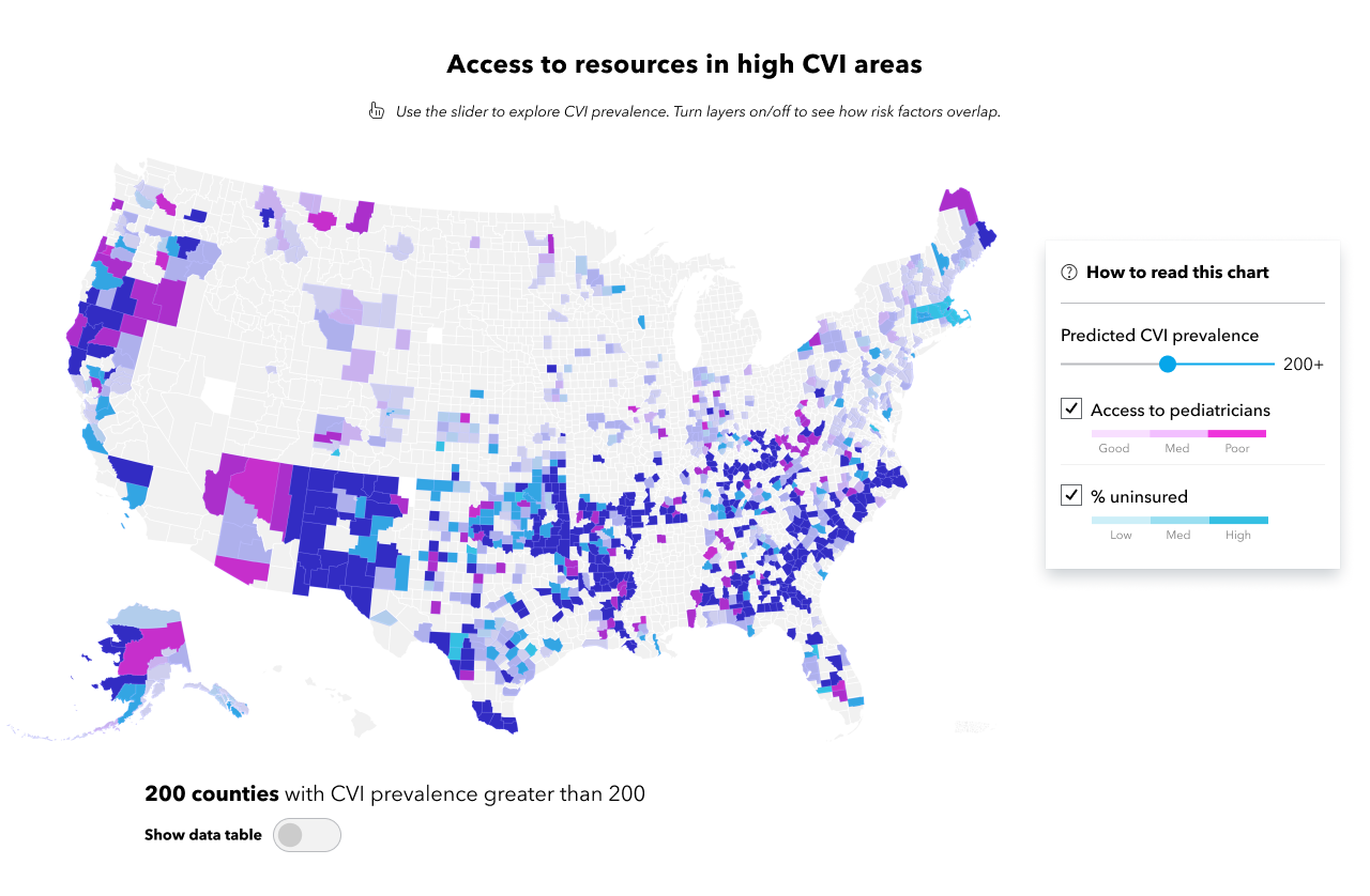
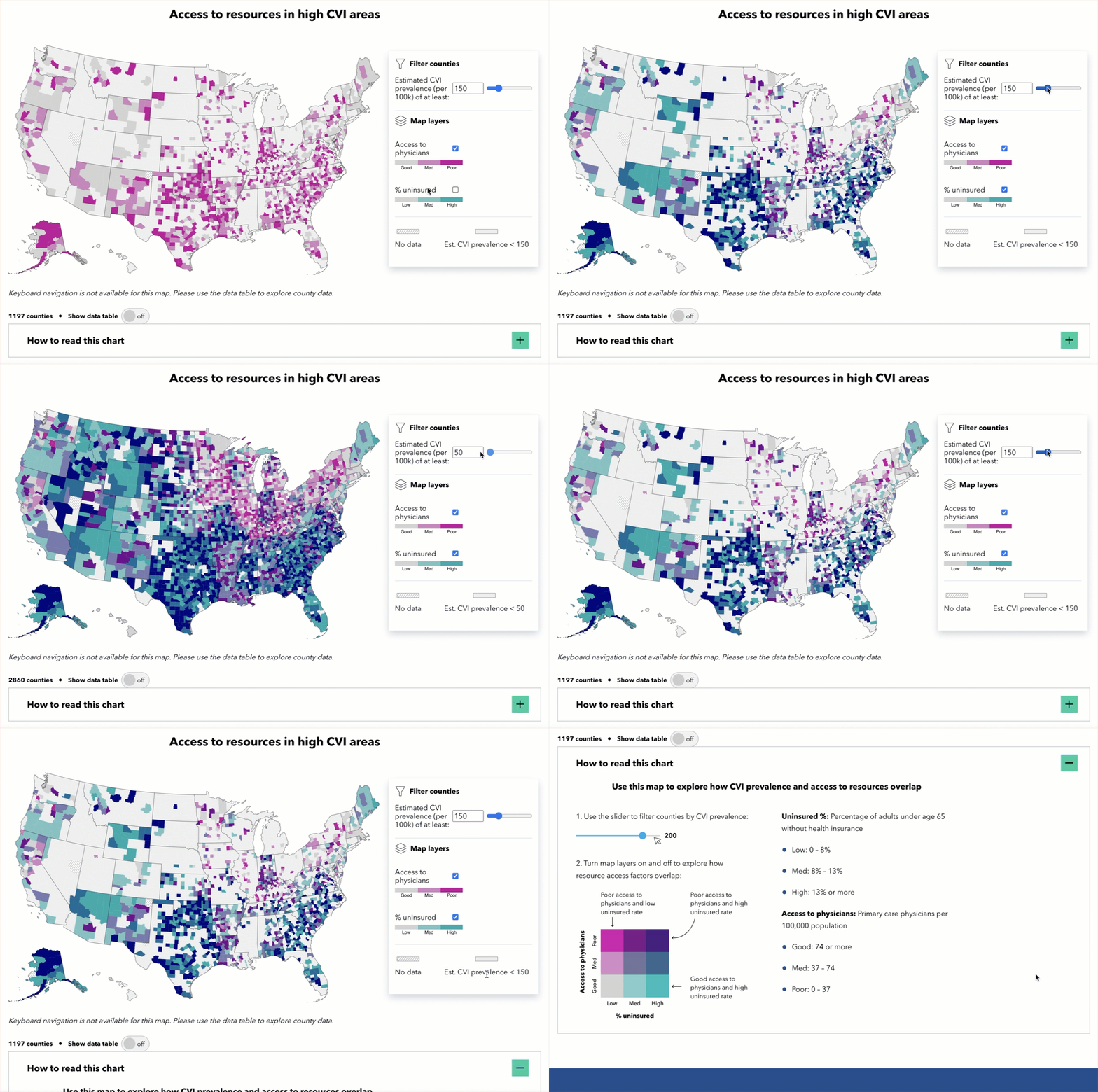
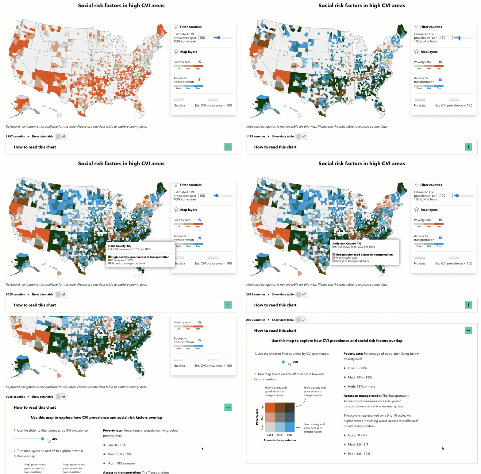
We opted for multivariate choropleth maps, enabling users to overlay and compare data points to identify regions that are at the highest risk of not receiving adequate care.
The initial goal was to allow users to overlay as many variables as possible, but that hindered clarity and usability for our audience:
After exploring various color palettes and visualization techniques, we settled on:
Applying constraints: We opted for simplicity, showing no more than three variables on the map at a time. To meet Perkins’ color accessibility standards, we allowed two color layers and added a third slider for CVI prevalence.
Using quantile scales: For a balanced representation of each variable without overshadowing others.
Toggling layers: Allowing users to turn on and off specific map layers for a customized view.
Early draft of the multivariate choropleth UI
This hands-on prototyping approach was crucial in ensuring the maps were insightful and user-friendly, allowing us to iterate based on how users would interact with and filter the maps.
Visual Design
I worked with the Perkins brand team in applying styles and color palettes that align with Perkins’ brand identity.
Humanizing the data
Illustrating the true prevalence of CVI


Exploring social risk factors
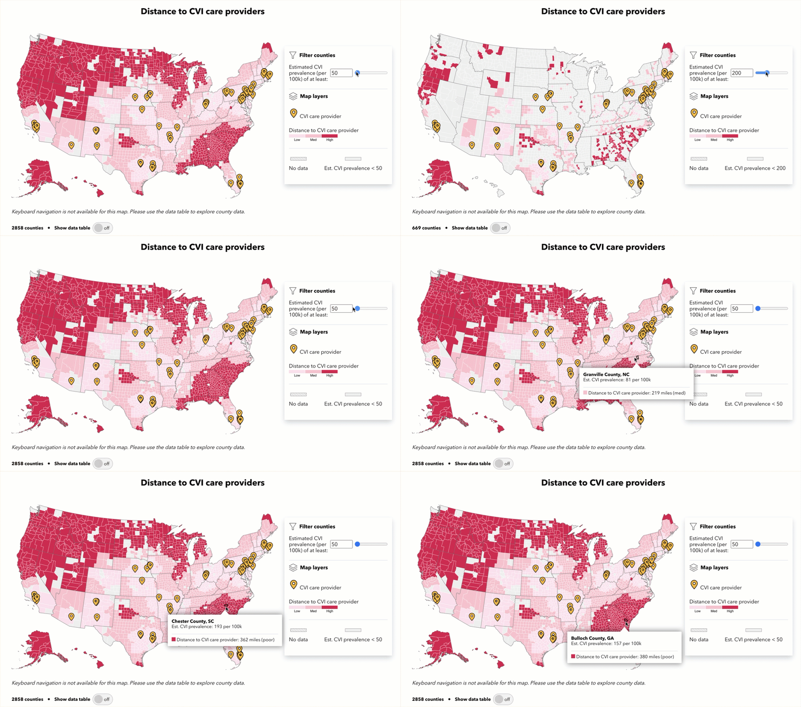
CVI expertise is lacking in certain parts of the U.S. In these areas, children who do not have access to specialized care may go undiagnosed. We plotted the distance to the nearest CVI care center and discovered disparities across the U.S., ranging from less than 1 mile in Massachusetts to over 400 miles in Georgia.
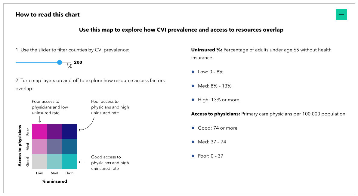
Lack of accessible resources limits opportunity. We identified areas with disproportionately fewer physicians per 100k people and high rates of uninsurance. In these areas, there might not be enough resources or pediatricians who know about CVI to help all the children who need it.
Additional social risk factors (poverty, poor transportation, maternal mortality, etc) may exacerbate the obstacles, leading to further gaps in diagnosis and support. This bivariate map shows how CVI prevalence data overlaps with the poverty rate and access to transportation.
Since multivariate maps can be hard to decipher, I included a “how to read this chart” for each visual
Designing for accessibility
This project shows data for 3,137 counties — presenting this data in an accessible way presented challenges and required thoughtful consideration.
Here, working with the expert accessibility team at Perkins was crucial; together, we problem-solved alternate formats that went beyond solely visual components. This allowed us to support a broad range of usability needs, including motion-sensitive users, hearing-impaired users, keyboard users, and screen readers.
Reflection
This was one of my favorite projects to date — I’m thankful and proud to have contributed to something so meaningful and shed light on such a common but underdiagnosed impairment.
Creating accessible data visualizations for such complex information was an interesting and daunting challenge from both a design and implementation perspective. And there is still a lot of work to be done in this field to make dataviz more accessible to all.


