Providing transparency into nursing homes
To comply with my confidentiality agreement, I have omitted and obfuscated client information.
We worked with a state Department of Health to simplify access to nursing home data for both the general public and DoH employees. Multiple data sources without a single source of truth made it challenging to monitor quality of care in nursing homes. Our goal was to create user-friendly platforms that would empower residents, advocates, and stakeholders to make informed decisions about nursing homes.
Impact
We designed and developed two tools in parallel:
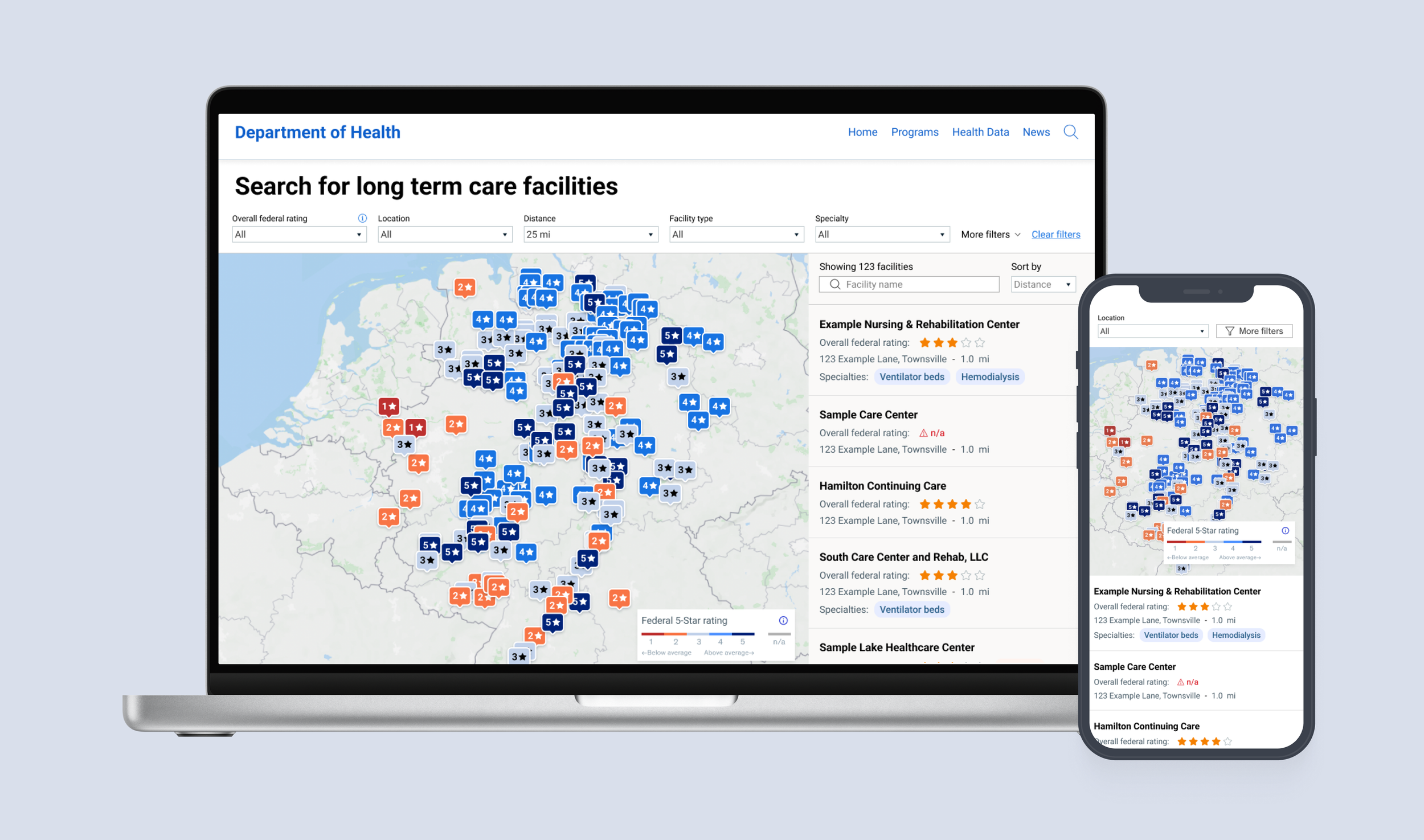
Public-facing tool
A user-friendly platform allowing state residents to easily search and compare nursing homes
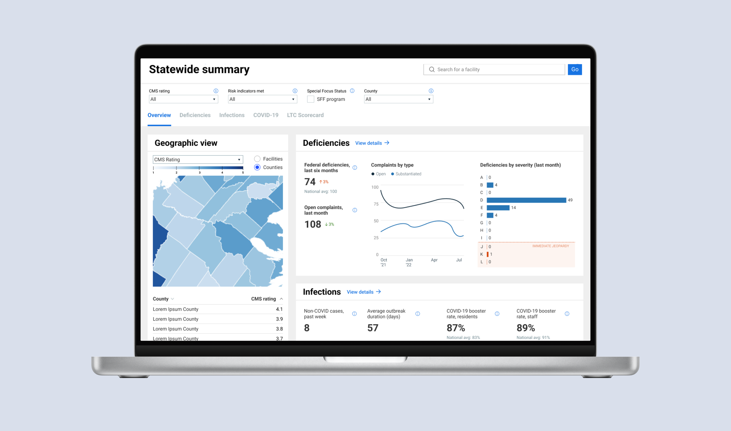
Internal dashboard
An intuitive dashboard for DoH teams to routinely assess nursing home quality and initiate interventions when necessary.
Since launch, our tools have been accessed by thousands, equipping DoH employees with valuable insights to enhance their work and safeguard nursing home residents.
Timeline
4 months
My role
I led the design on this effort, working alongside a junior designer and two BI experts. I was responsible for:
Product design
User research
UI/UX design
Data visualization and dashboard design
Usability testing
I owned the design for the public-facing tool and coached the junior designer through designing, iterating, and testing the internal Tableau dashboard.
Discovery
Understanding the current state
The Department of Health already had a public facility search website, but it fell short on delivering crucial information:
Not enough context and data: Users had to turn to other websites and sources to find all the information they needed about the nursing home
Unintuitive design and navigation: The website assumed users knew exactly which facility they wanted to look at
Missing features: The website only offered data at the facility level, and the landing page offered no summary or aggregation
“Competitive” SCAN
We examined how other platforms effectively translate complex data into easily understandable formats, identifying best practices and familiar user experiences in public-facing maps and data visualization.
User research
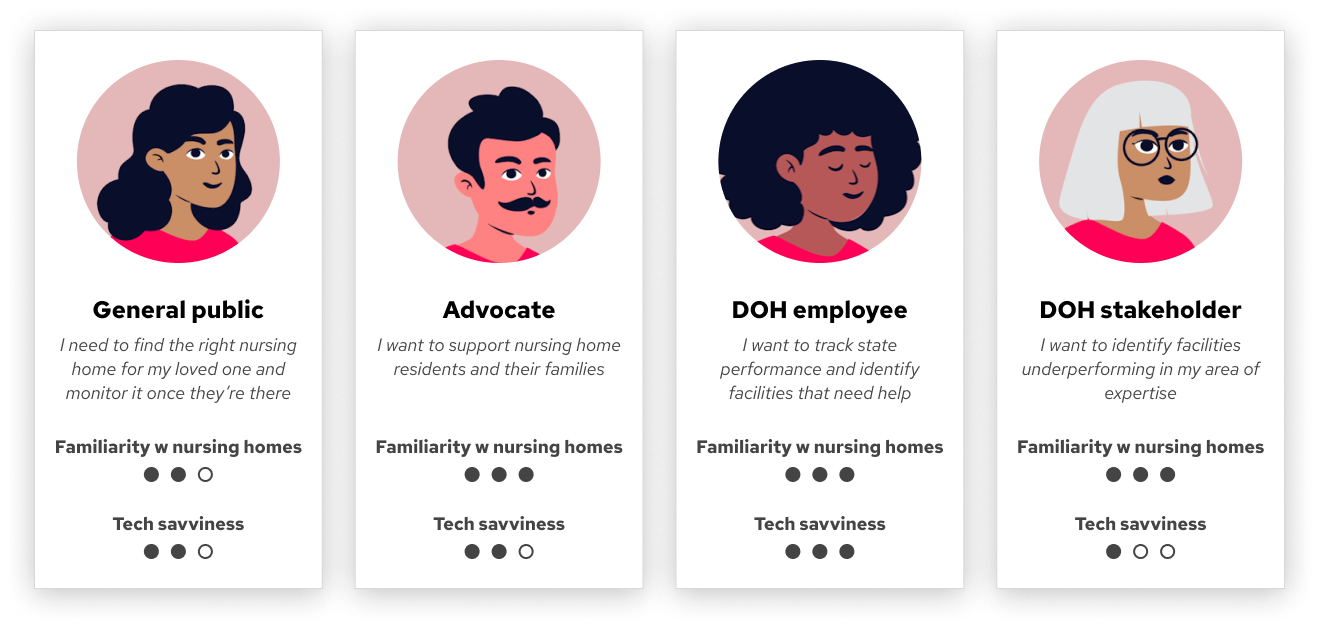
We conducted extensive research to cater to a diverse user base, including the general public, advocates, and DoH employees. I clustered quotes and insights in Miro and used that to inform our personas:
“You’re not in a good place emotionally when you’re looking for this. Nobody wants to put their loved ones away.”
Interviews with the general public stressed the need for a simple design. Our users would likely be visiting this page at an extremely stressful and difficult time in their life, so it was on us to ensure a hassle-free experience.
Wireframes
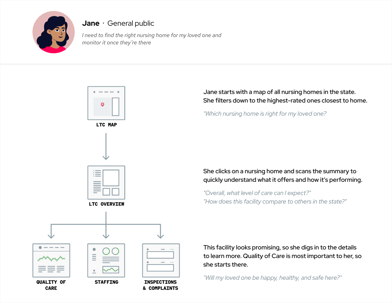
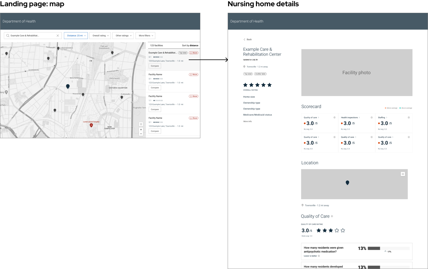
I designed the information architecture around the user journey:
I experimented with various layouts and designs for the facility detail page — would it be better to have one long page, navigated by anchor links (à la Redfin or Zillow?), or to spread the data across multiple tabs?
The client initially deliberated between developing the public tool using Tableau or as a React web app, weighing the pros and cons of each approach. Ultimately, they decided on Tableau due to time constraints and ease of maintenance.
As a result, I worked closely with our BI developers to refine the design for implementation within the Tableau environment.
Iteration & testing
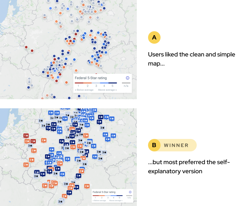
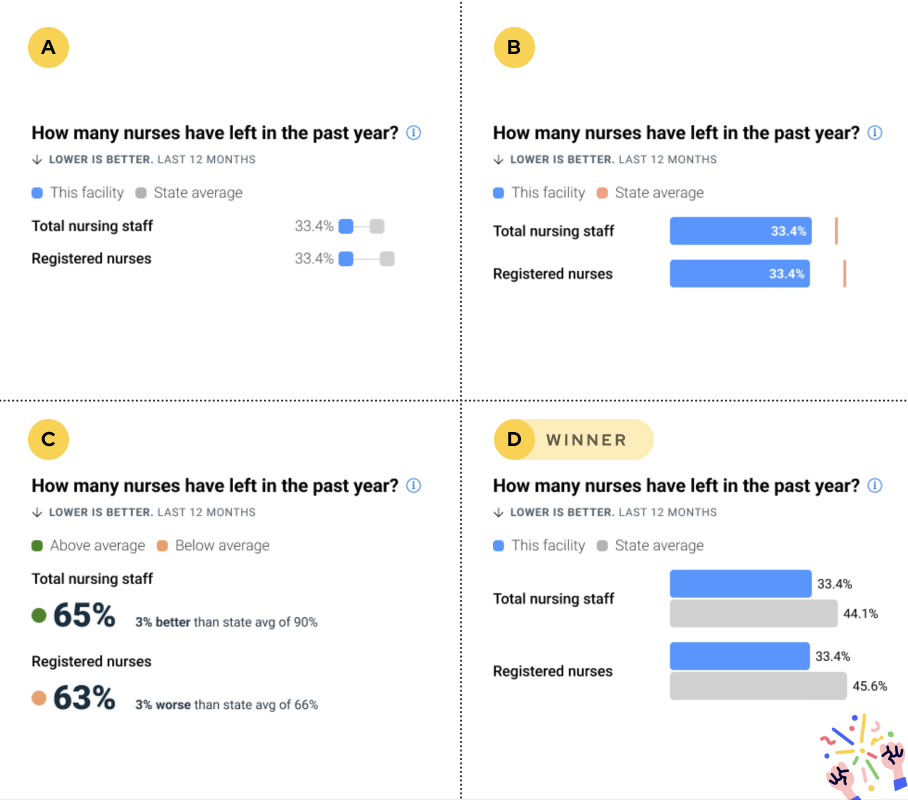
I built and iterated on Figma prototypes and led user testing sessions. By A/B testing different visuals, we learned that even slight tweaks can make a big difference in clarity and usability.
User testing insights
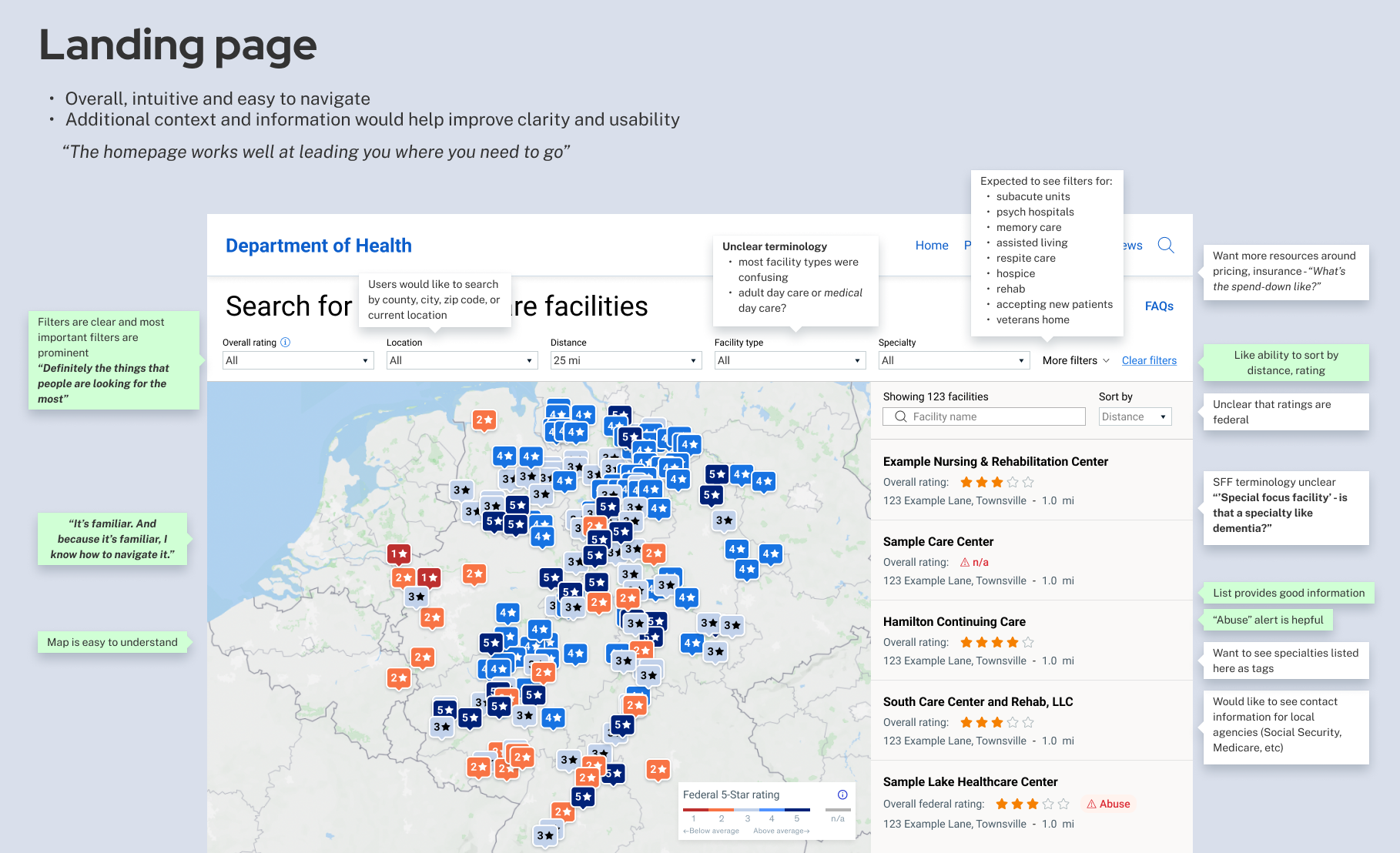
Keep it simple and familiar: Given the often stressful circumstances surrounding nursing home searches, a straightforward and familiar user experience was key
Reduce cognitive load: AKA, don’t over-simplify. Users preferred intuitive visuals that required minimal effort to decipher.
Provide context: Clear, plain-language explanations about data and terminology were essential for understanding and decision-making.
Detailed testing readout
Final design
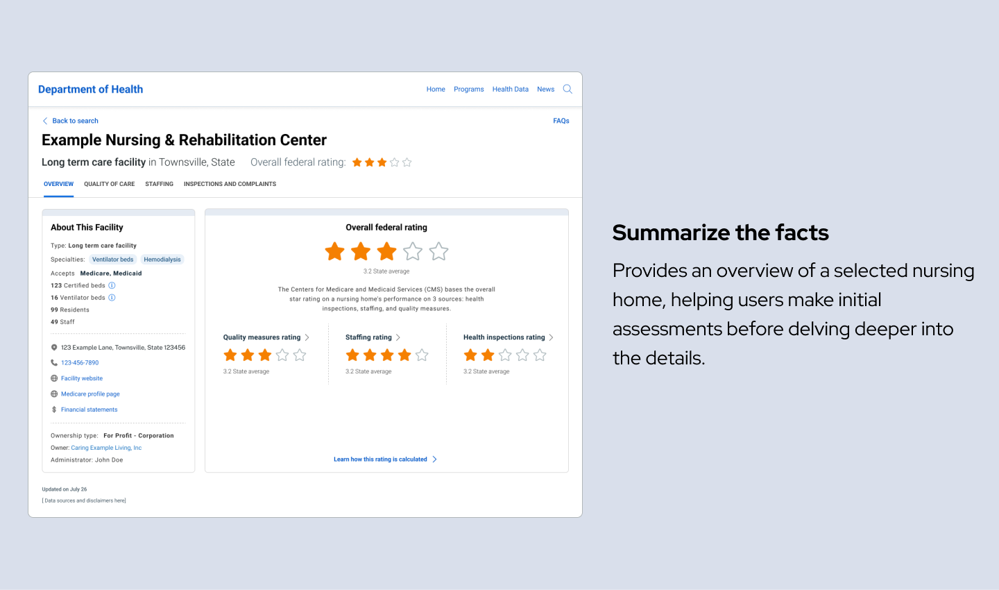
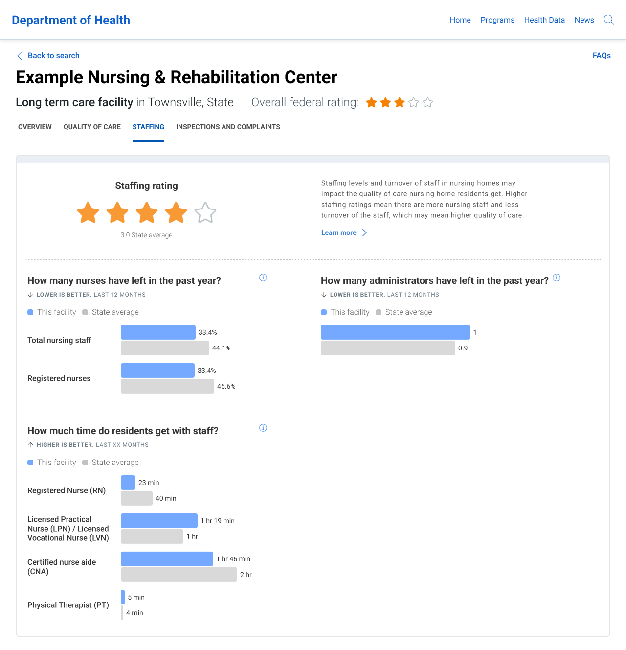
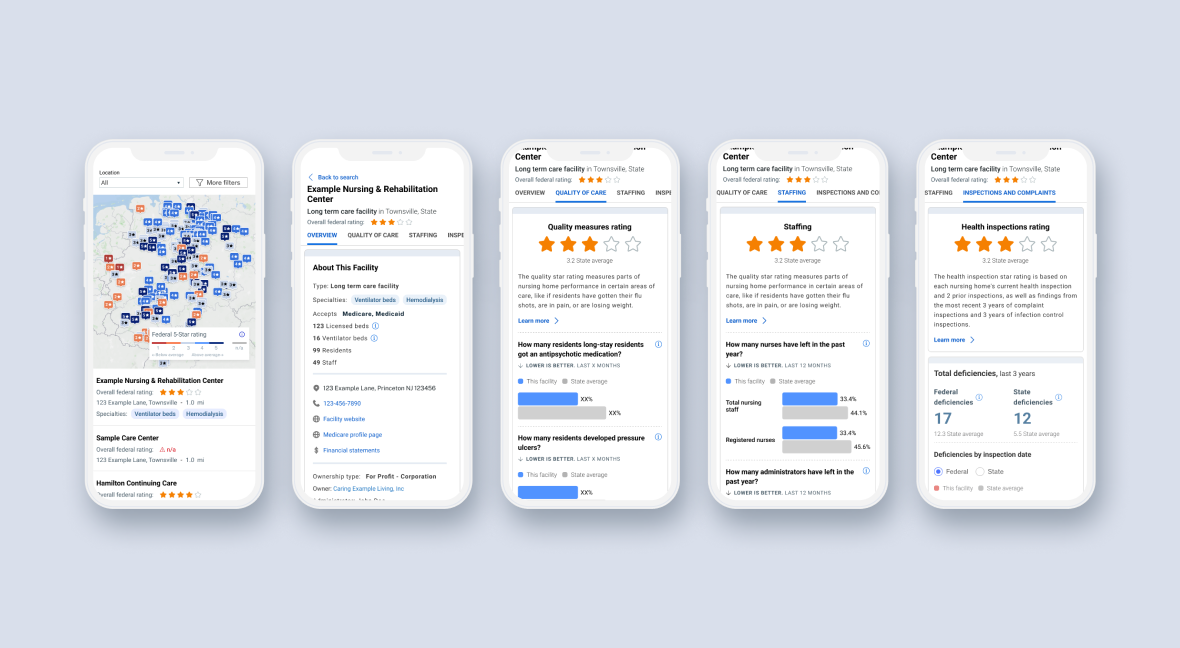
Public website
“Yes, that’s what i’m looking for. I want a report card, a scorecard — that’s perfect.”
Internal dashboard
Reflection
This project was not just about redesigning a website; it was about making a meaningful impact on tens of thousands of lives during challenging times. By simplifying access to nursing home data and creating more of a one-stop-shop, we empowered residents and stakeholders to make informed decisions and enabled DoH employees to monitor and improve nursing home quality effectively.
I’m glad I had the privilege to be a part of this project. To me, it truly underscored the power of user-centered design in enhancing public services and improving lives.

