Tracking COVID-19 vaccinations
In 2021, tracking vaccination progress was a critical aspect of managing the COVID-19 pandemic. The McKinsey COVID Response Center aimed to provide a comprehensive and intuitive way for users to explore and understand vaccination data and trends.
I co-led the design of this interactive, working closely with designers, developers, copy editors, and subject matter experts from concepting to launch and maintenance. The interactive drove over 2 million pageviews to the COVID Response Center, providing critical insights during the pandemic.
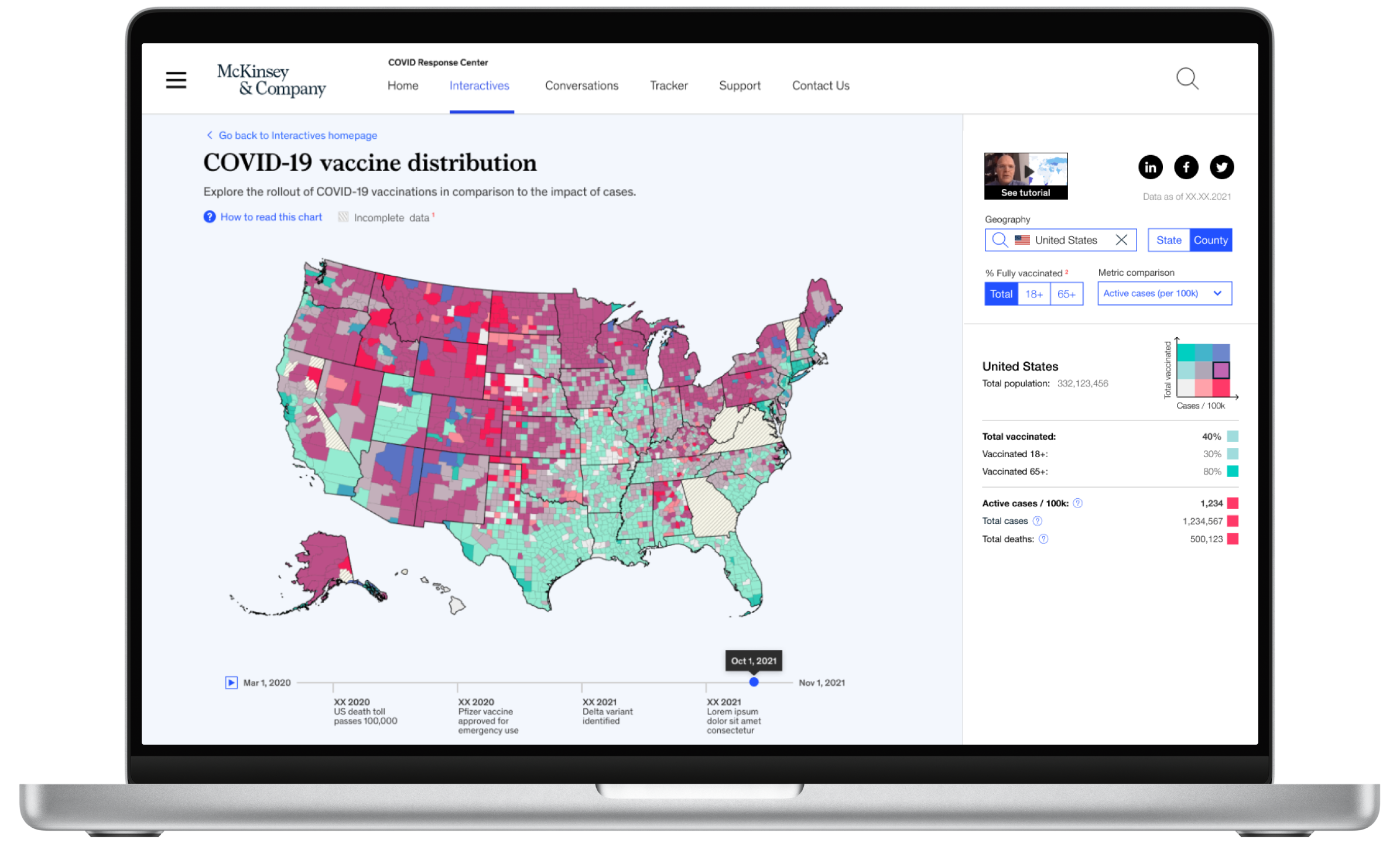
Map
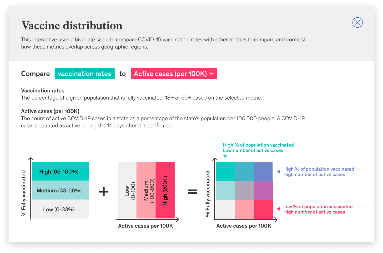
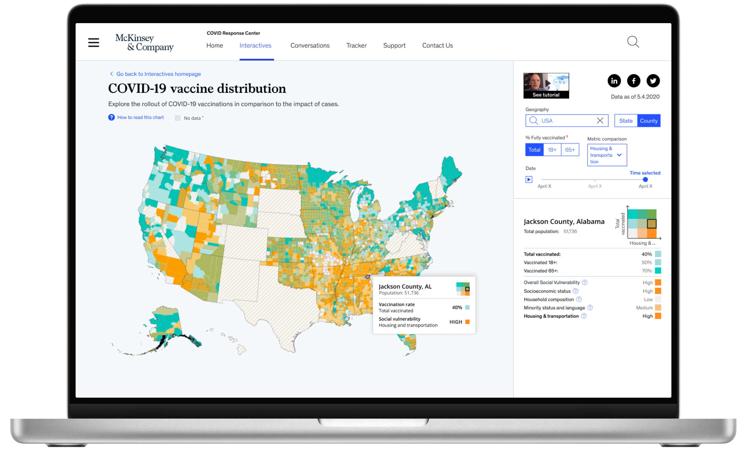
I proposed presenting the data on a bivariate choropleth. This approach offered a unique perspective on the data, distinguishing our visualization from others already available in the market. While numerous websites and agencies were already mapping vaccination rates, my design allowed users to monitor vaccination progress alongside the spread of the virus.
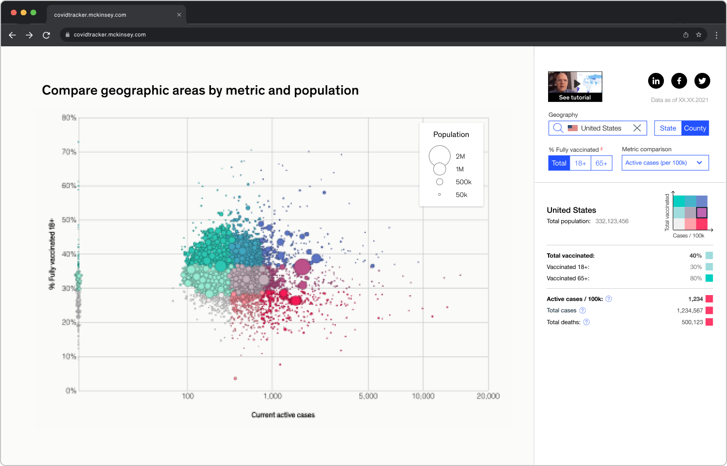
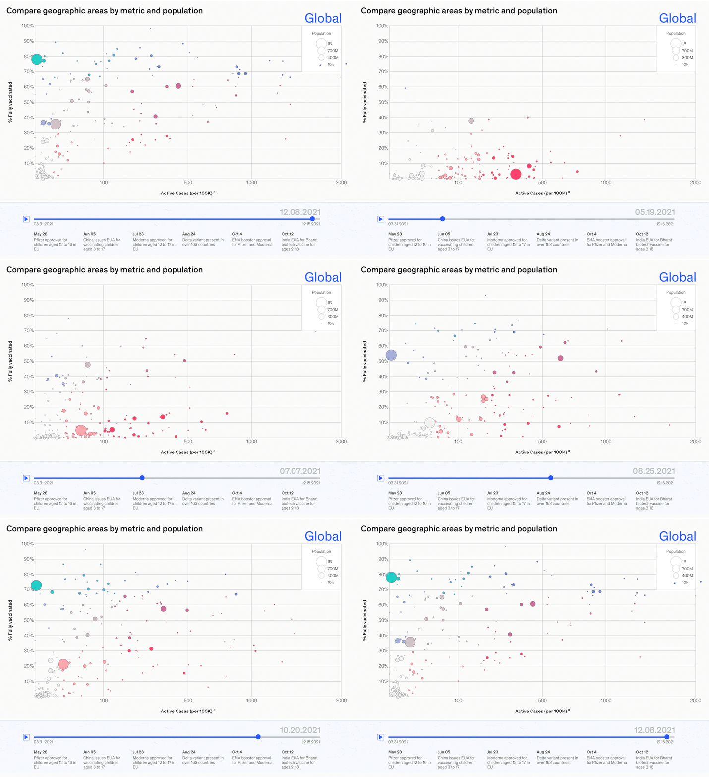
Scatter plot
The scatter plot allows users to identify correlations or trends between vaccinations and cases.
Data table
The data table provides a comprehensive view of the data, allowing users to:
Sort data by various metrics (e.g., population, vaccination rate, new cases)
Search for specific regions or countries
Maintenance & updates
After launch, we continued to iterate and make improvements to help users draw more meaningful insights from the data in the ongoing fight against the pandemic.
For example, we incorporated social vulnerability data to allow users to track vaccination progress within vulnerable or disadvantaged populations.
Once there was enough longitudinal data, we added a timeline feature to allow users to explore how cases and vaccination efforts evolved over time.


